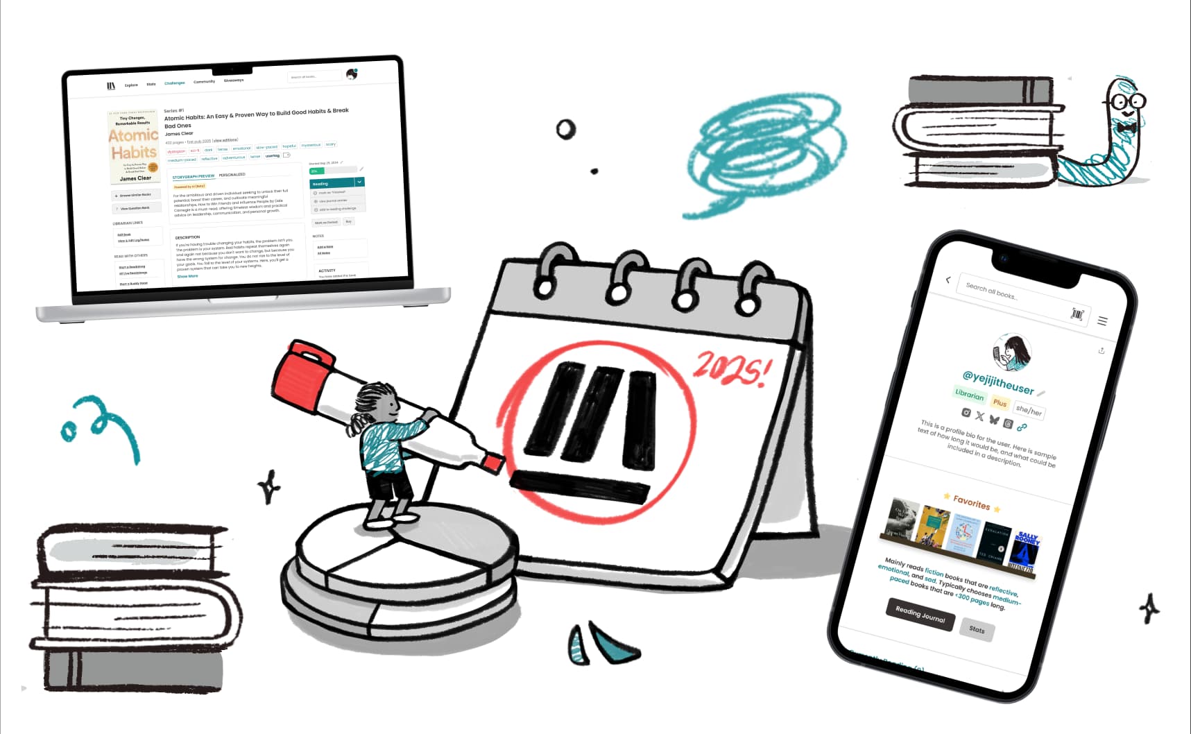
The StoryGraph is a beloved book-tracking platform with 4M+ users and the leading alternative to Goodreads. My role was to revamp the platform’s interface and user experience — bringing polish, clarity, and accessibility — all while respecting the constraints of their one-woman dev team.
Role
Contract UX Designer
Timeline
August 2024 - April 2025
Skills
UI/UX DesignUser ResearchDesign SystemsBrand
BACKGROUND: FROM USER TO OFFICIAL DESIGNER
Before joining as a designer, I was an avid StoryGraph fan myself. I admired their mission and community spirit, but also became immediately familiarized with friction points first-hand.
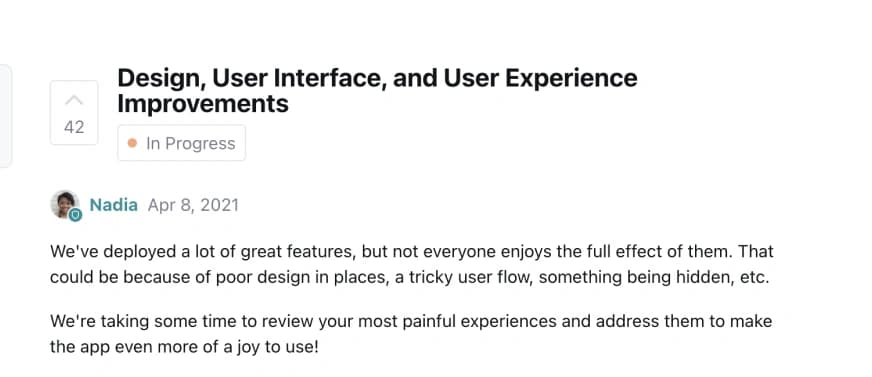
Seeing that design improvements were already a major goal in their roadmap, I decided to dive into researching to try my hand at fixing some of the issues.
Seeing that design improvements were already a major goal in their roadmap, I decided to dive into researching to try my hand at fixing some of the issues.
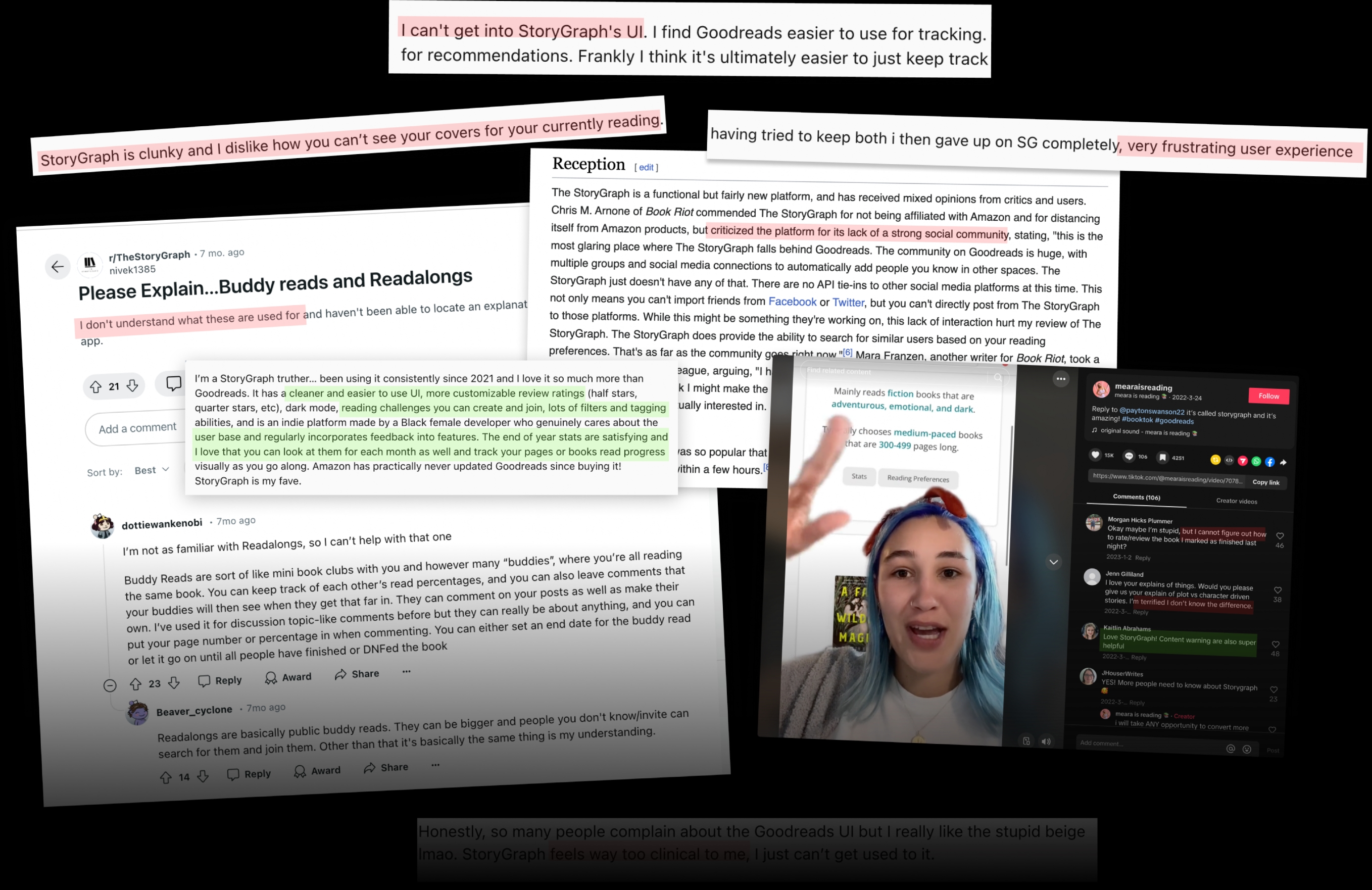
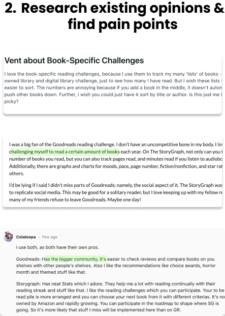
The StoryGraph is known for its large, highly-active online communities; I studied countless discussions across their subreddit, forums, and TikTok/YouTube reviews.
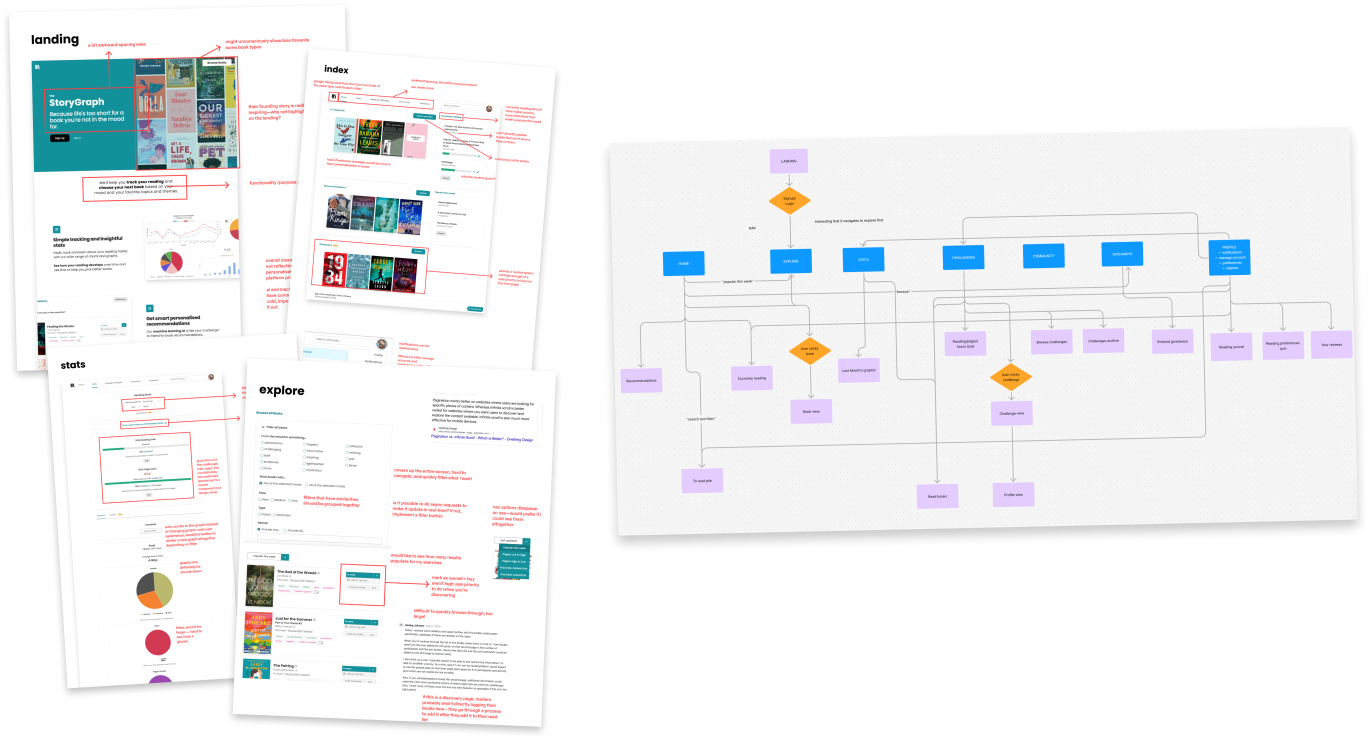
Annotated every page of the platform to identify pain points, then mapped user flows (revealing overnavigation).
PAIN POINTS
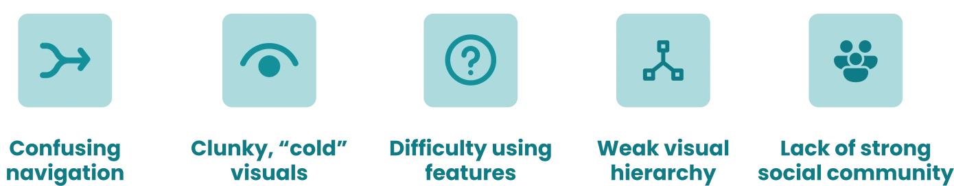
Consolidating insights from my research & 5 user interviews.
PHASE 1: CONCEPT REDESIGN
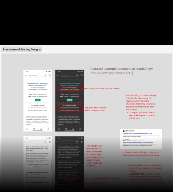
I created proof-of-concept redesigns to test:Simplified flows, reducing unnecessary clicks. A touch of rebranding to feel warmer, less clinical, but still undeniably The StoryGraph. Added visual hierarchy to pages with lots of static text. This research and early concepts eventually led to my role as an official contract designer at The StoryGraph!
PHASE 2: OFFICIAL REDESIGN
Now that I was officially designing for them, I had to ask myself:
How could I revamp The StoryGraph’s experience by simplifying navigation, surfacing hidden features, and ensuring accessibility, while still respecting the limits of a one-woman dev team and avoiding a full system overhaul?
THE PROCESS
Following this process I developed to best suit their one-developer team and constraints, I...
Maintained detailed notes on my rationale behind design decisions, accessibility considerations, and interactions like hover states.
Clear documentation streamlined collaboration for our tiny team serving millions and reduced handoff friction.
Clear documentation streamlined collaboration for our tiny team serving millions and reduced handoff friction.
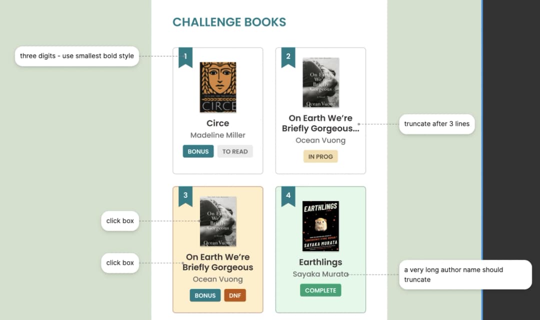
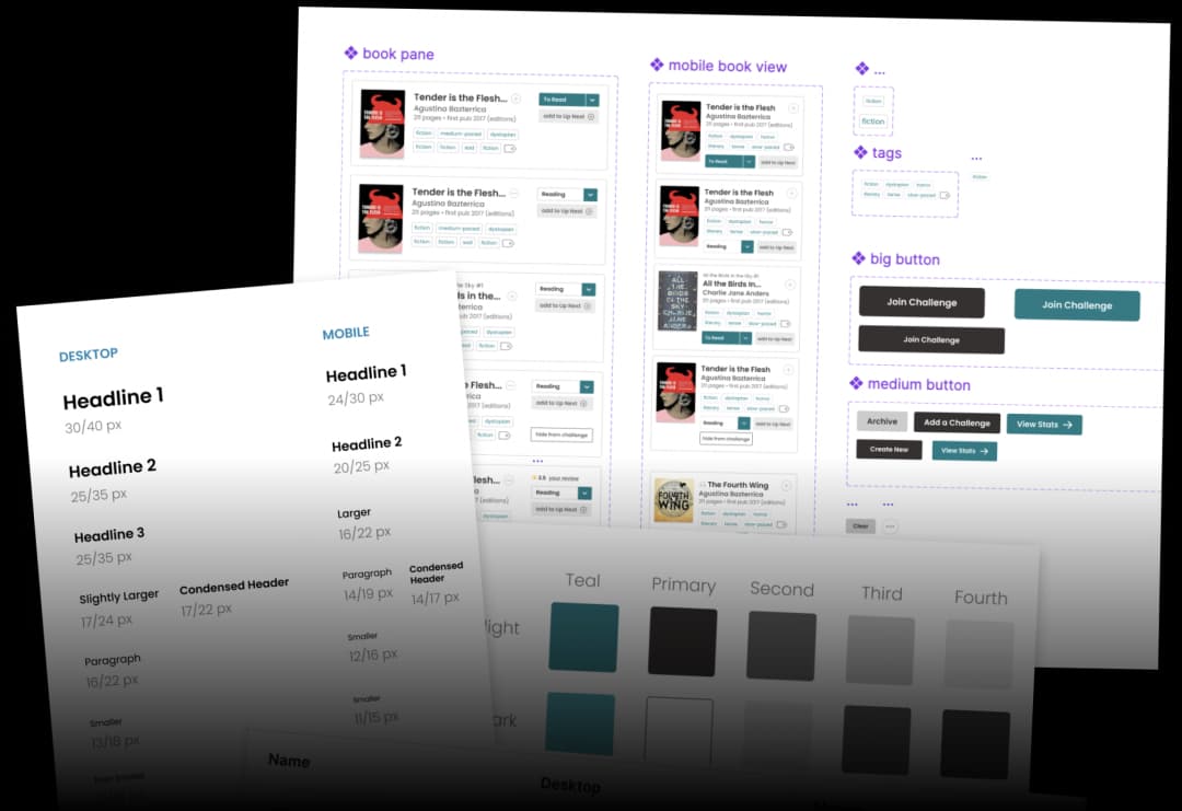
Developed a robust design system covering:Responsive layouts and font sizing for desktop, tablet, & mobile screens. Consistent light and dark mode colors. Reusable component library (buttons, inputs, cards) covering a variety of completion states. WCAG 2.2 accessibility-first guidelines.
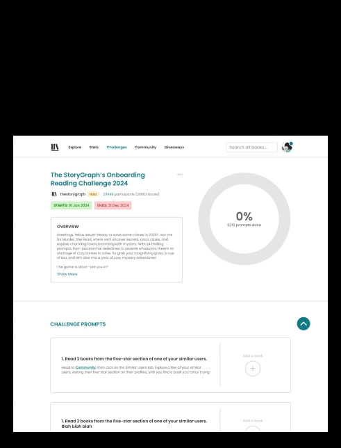
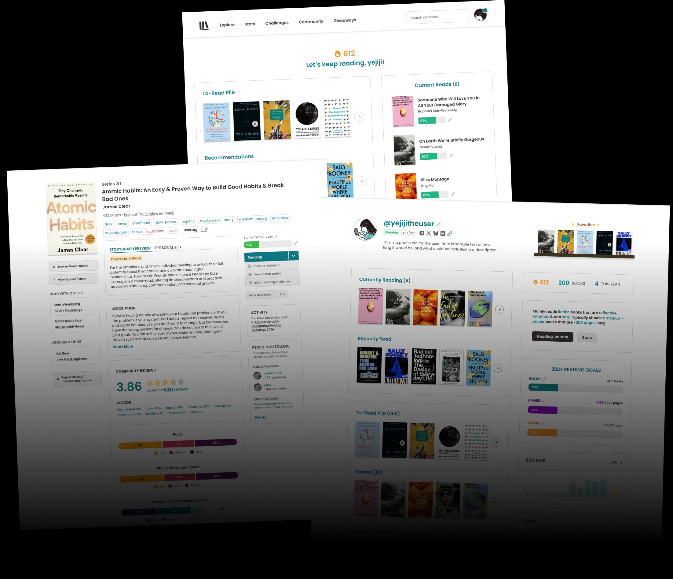
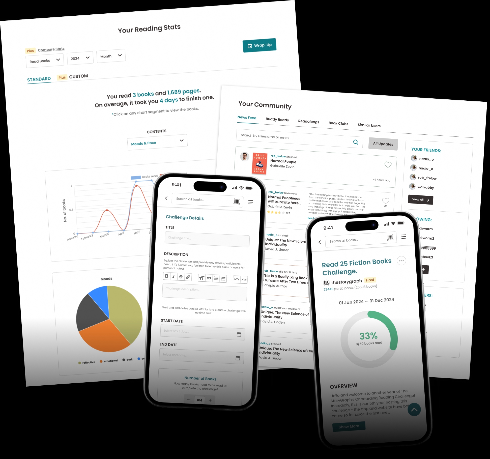
Ultimately, this led to shipped, iterative page revamps! I refreshed every page while also documenting my design rationale, accessibility considerations, and interaction details — which streamlined collaboration and reduced handoff friction for our small team serving millions.
OUTCOMES
LEARNINGS
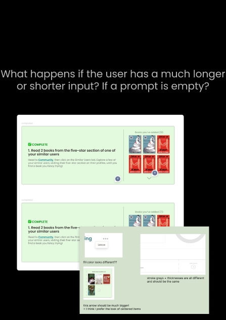
- Making design modular is hard, but rewarding.
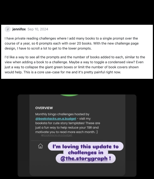
The best design adapts to the diverse inputs users put in. - Talk with your founders and user as often as you can.
They reveal overlooked details and edge cases I wouldn’t have thought of alone. - Color is powerful, even in subtle ways.
Simple choices, like using teal for inputs/CTAs and black for text gave the design overall much more cohesion. - Sometimes, the most “visually” appealing choice isn’t always best.
Certain design choices like omitting repetitive text looked cleaner, but user testing revealed it to be less accessible. - There will always be design–dev discrepancies.
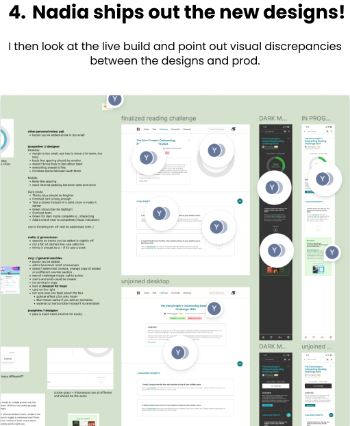
The key, however, is working closely with developers to minimize them.